
How to Use PowerPoint: A Complete Beginner’s Guide (2026)
To use PowerPoint, open the app, choose a theme from the New screen, type your title on slide 1, and add new slides with Home > New Slide. Drop in text, images, and shapes from the Insert tab. Save with Ctrl+S, press F5 to start the slide show, Esc to exit. That is the full starter loop. Every other PowerPoint feature is built on top of it.
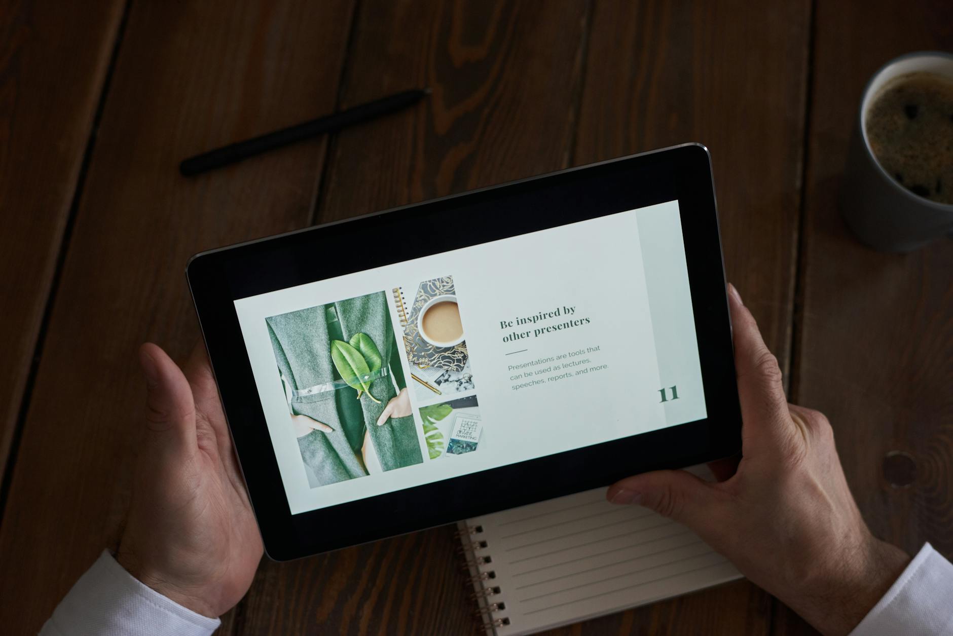
I have been training PowerPoint to working professionals in Singapore for over 24 years. About 200 adult learners walk through our training room each year, and almost every one of them starts in the same place: a blank screen, a deadline at 5pm, and a boss who wants a deck by Friday. Managers can be quite demanding like that. This guide is the version I wish every one of them had on day one. It covers the interface, your first deck in seven steps, layouts and themes, animations without the seasickness, speaker notes, Presenter View, delivery from a laptop or in a Teams or Zoom meeting, posters and interactive lessons, plus the last section most tutorials skip: the five habits that separate decks that get read from decks that get clicked through and forgotten.
What PowerPoint actually is (and where it beats Canva and Google Slides)
PowerPoint is presentation software made by Microsoft. Think of a deck like a flip-chart pad. Each slide is a page you turn in front of an audience. You build your pages with text, images, charts, video, and shapes. Then you run the deck full-screen, or send the file (.pptx) so the other person can read it on their own. It runs on Windows, Mac, the web (powerpoint.office.com), iOS, and Android.
The reason PowerPoint is still the corporate default after 35 years and a dozen competitors is feature depth. Slide Master editing, full animation control, embedded fonts, Presenter View, accessibility checks, dense charting via Excel, and Copilot AI assistance in Microsoft 365 are all in the box. Most Singapore offices, schools, and government agencies still expect a .pptx file when you send a deck. That alone makes PowerPoint worth learning — a point IMDA’s Digital Skills for Business programme echoes in its core skills list for working adults.
Here is the honest comparison your boss will not say out loud. Pick PowerPoint for client decks, board updates, training materials, and anything you will deliver in a meeting room. Pick Google Slides when two or three people need to co-edit the same deck at the same time and feature depth does not matter. Pick Canva for marketing-led, visually polished collateral where the template library does the heavy lifting. For most working professionals in Singapore, PowerPoint is the one you must know. The other two are nice-to-haves. If your day job is marketing or event design, our Canva Design Masterclass covers Canva separately. But you will still meet PowerPoint at the next steering committee meeting. Trust me.
The PowerPoint interface in 5 minutes
Open PowerPoint and create a blank deck. Three areas matter. The ribbon at the top. The slide thumbnail pane on the left. The slide canvas in the middle. Below the canvas is the notes pane for speaker notes (View > Notes if you do not see it).
The ribbon is a horizontal bar of tabs. Each tab is a toolbox for a different job:
| Tab | What you do here |
|---|---|
| Home | New Slide, Layout, Reset, change fonts, paragraph alignment, find and replace. The day-to-day tab. |
| Insert | Add text boxes, pictures, shapes, charts, tables, icons, SmartArt, video, audio, equations, headers, footers. |
| Design | Pick a theme, change the colour variant, change Slide Size (Standard 4:3, Widescreen 16:9, Custom for posters). |
| Transitions | Effect that plays between slides (Fade, Push, Morph). One transition per slide. |
| Animations | Effect that plays on objects within a slide (a bullet appearing, an image flying in). Many animations per slide if needed. |
| Slide Show | From Beginning (F5), From Current Slide (Shift+F5), Set Up Slide Show, Hide Slide, Rehearse Timings, Use Presenter View. |
| Review | Spelling, Translate, Comments, Accessibility Checker. |
| View | Normal, Slide Sorter, Notes Page, Slide Master, Ruler, Gridlines, Guides, Zoom. |
| Record | Record a slide show with narration, take screen recordings, capture screenshots. |
PowerPoint runs almost identically on Windows and Mac. Shortcuts differ (Cmd instead of Ctrl) but the ribbon layout matches. PowerPoint for the web at powerpoint.office.com has a smaller subset of the ribbon (no Slide Master editing, no Record tab, fewer animations) but covers everything a beginner needs and is free with a Microsoft account. On a Chromebook, run the web version in Chrome. On an iPad or iPhone, install the free PowerPoint app. Useful for last-minute edits in a Grab on the way to a client. Less useful for serious deck building.
One clarification because people search for it. PowerPoint does not run inside Google Docs or Google Drive as a native editor. If you open a .pptx file in Google Drive, it opens in Google Slides, which is a different application. You can edit there and download it back as .pptx, but you will lose animations and some formatting. If fidelity matters (and for a client deck it always does), use the actual PowerPoint web version.
Your first slide deck: a 7-step walkthrough
This is the snippet-bait section. Seven steps, blank screen to saved and presentable deck.
- Open PowerPoint and choose a theme. On the New screen you see Blank Presentation and a row of built-in themes. Pick one. The Ion or Wisp themes are safe, professional defaults. Click Create.
- Edit the title slide. Slide 1 has two placeholders: title and subtitle. Click each in turn and type. Keep the title short. A single line if possible.
- Add a new slide. Home > New Slide drops in a “Title and Content” slide. Click the small dropdown arrow on New Slide to see other layouts (Two Content, Comparison, Picture with Caption, Section Header).
- Add content. Click the title placeholder and type the slide title. Click the body placeholder and type bullet text, or use the small icons in the middle (Insert Table, Insert Chart, Insert Picture, Insert SmartArt).
- Insert an image. Insert > Pictures > This Device for a local file. Stock Images for built-in royalty-free photos. Online Pictures for Bing search. Click the image, drag the corner handles to resize without distorting. Always the corner. Never the side handle, or you will squash it.
- Save the deck. File > Save As, pick a folder or OneDrive location, give the file a name, click Save. Or press Ctrl+S. If you save to OneDrive, AutoSave handles every change from then on. Do try it.
- Present it. Press F5 to start from slide 1, Shift+F5 to start from the current slide. Use arrow keys or the space bar to advance. Press Esc to exit.
That seven-step loop is your entire starter skill set. You will repeat it for every deck you ever build. Most of your improvement after that is judgement, not new buttons. For a longer walk-through that goes deeper on layout and content, see our step-by-step PowerPoint presentation guide.
Designing slides: layouts, themes, slide masters and the ruler
Once you can build a deck, the next thing that separates a good slide from a noisy one is consistent design. PowerPoint gives you four design controls. They work in a hierarchy, like Russian nesting dolls.
Layouts are templates for individual slides: Title Slide, Title and Content, Two Content, Comparison, Section Header, Blank, Picture with Caption. Change a layout from Home > Layout, or right-click the slide thumbnail and choose Layout. Each layout has placeholder boxes for title, body, and images, already sized and positioned. Half the design work is done for you.
Themes are the visual style applied across the whole deck: colours, fonts, background, the default look of every layout. Change a theme from the Design tab. One click and every slide restyles at once. Fantastic when you realise at 9pm that the deck needs to match the client’s brand colours.
Slide Master view is where the theme is actually defined. View > Slide Master shows the parent slide that controls every layout. If you want a company logo on every slide, a footer with the date, or a consistent title font size, edit them here once. The change propagates everywhere. Close Master View when done (View > Normal, or Close Master View on the ribbon). I have seen learners spend an hour clicking through 30 slides to change a logo manually, when one Slide Master edit would have done it in 20 seconds.
The Ruler, Gridlines, and Guides under the View tab are your alignment helpers. Switch them on for any deck with more than two objects that need to line up: graphs against text blocks, a row of icons, a comparison table. The Ruler shows measurements in centimetres (Singapore default, we use A4 not letter) or inches. Guides are draggable dashed lines you use to align objects across slides. Watch for the Smart Guides too. They are the pink dashed lines that appear automatically when you drag an object near another object. They are PowerPoint’s hint that you are about to align cleanly.
Three design rules carry most of the load. Keep body fonts at 30pt or larger so the back row can read it. Contrast dark text on a light background (or the reverse). Use no more than two fonts in the whole deck. Beyond those three, restraint matters more than rules. Every extra colour, font, or decoration is one more thing the audience has to process while you talk.
Adding animations and transitions (without making people seasick)
PowerPoint has two different effects tabs and almost every beginner confuses them. Transitions are what happens between slides. Slide 4 ends, slide 5 fades in, pushes in, or morphs into place. Animations are what happens to objects on a single slide: a bullet point appears one at a time, an image flies in, a chart grows from zero.
To add a transition, click a slide in the thumbnail pane, go to the Transitions tab, pick an effect (Fade, Push, Wipe, Morph). Click Apply to All if you want the same transition on every slide. Set Duration to 0.5 seconds or shorter. Slower than that and the audience starts checking their phones.
To add an animation, click an object on a slide (a text box, a bullet list, an image), go to the Animations tab, pick an effect. Four kinds of animation exist:
- Entrance: object appears.
- Emphasis: object changes while visible (pulse, colour change).
- Exit: object leaves.
- Motion Path: object follows a drawn path.
For most decks, one Entrance effect per object is plenty.
Animation gets a bad name because beginners overuse it. Three rules will keep your deck professional:
- At most two animation styles per deck. Pick one Entrance (Fade is a safe bet) and at most one Emphasis. Mixing five different effects on the same slide is the slide-deck equivalent of wearing every accessory you own.
- On Click, not With Previous. Keep animations triggered by your click, so they support what you are saying. Auto-advance animations run either too fast or too slow. Never just right.
- Duration under 0.5 seconds. Slow animations waste audience attention. You only get so much.
For the detailed walkthrough including object animation order, motion paths, and the Morph transition, see our guide to adding animations in PowerPoint and the deeper advanced PowerPoint animation techniques article. Microsoft 365 subscribers can also use Designer (under the Home tab) and Copilot in PowerPoint to suggest animation and layout choices automatically. The Word, Excel, PowerPoint Copilot in Microsoft 365 course covers the AI-assisted shortcuts. Do try Designer at least once — it will redesign an ugly slide in two clicks.
[CourseCTA: primary]
Speaker notes and Presenter View
Speaker notes are the script that lives at the bottom of each slide. The audience never sees them. You do, on your own screen, while presenting. They are the difference between a polished delivery and a panicked one.

To add notes, click in the Notes pane at the bottom of the canvas (View > Notes if it is hidden) and type. Keep notes short. Two or three lines per slide. They are reminders, not a full script. To print notes alongside the slide thumbnails for a hard-copy version, File > Print > Full Page Slides (dropdown) > Notes Pages.
Presenter View is PowerPoint’s killer feature for live delivery. On a dual-screen setup (laptop plus projector, or laptop plus boardroom screen), your laptop shows Presenter View while the audience screen shows the actual slide. Presenter View has four panes:
- Current slide (large, on the left): what the audience is seeing right now.
- Next slide (smaller, top right): a thumbnail of what comes next, so you can transition smoothly.
- Speaker notes (bottom right): your notes for the current slide.
- Timer and slide number (top, with pause and restart): how long you have been presenting.
To switch it on: connect your second screen, Slide Show > Use Presenter View (tick the box), then F5. PowerPoint puts Presenter View on your laptop and the slide on the external screen automatically. If they end up swapped, press the Display Settings button at the top of Presenter View and choose Swap Presenter View and Slide Show. Simple.
On a single-screen setup (no second monitor), press Alt+F5 to launch Presenter View anyway. It is excellent for rehearsal. You see the timer, the notes, and the next-slide preview without needing a second monitor.
Here is one anecdote I always tell in class. A senior director walked into our office one evening asking for presentation skills training. We told him the next public class was in two weeks. He needed it sooner. When? Now. Tonight. His firm had submitted a major technical tender, and the client wanted to hear the proposal directly from the engineers who would do the work, not from him. The engineers were brilliant technically but tongue-tied when speaking. They trembled. They could not get the words out. He brought them to our office that evening and we coached them for three hours: how to stand, where to look, how to pause, how to build a tight slide deck, how to fake confidence until it became real. We stayed past four hours getting them to practise, and a huge part of that practice was running through their deck with Presenter View on a borrowed second monitor, so they could see the next slide coming and breathe through the pause. The next day they presented. They won the deal. Confidence is a muscle, not a personality trait. People who appear confident on stage have rehearsed.
For the full walkthrough including the laser pointer, ink annotations, the “See all slides” navigator, and the “black or unblack slide show” trick, see our Presenter View guide.
Delivering the presentation: laptop, online meeting, or boardroom
Where you present from changes how you set up the deck.
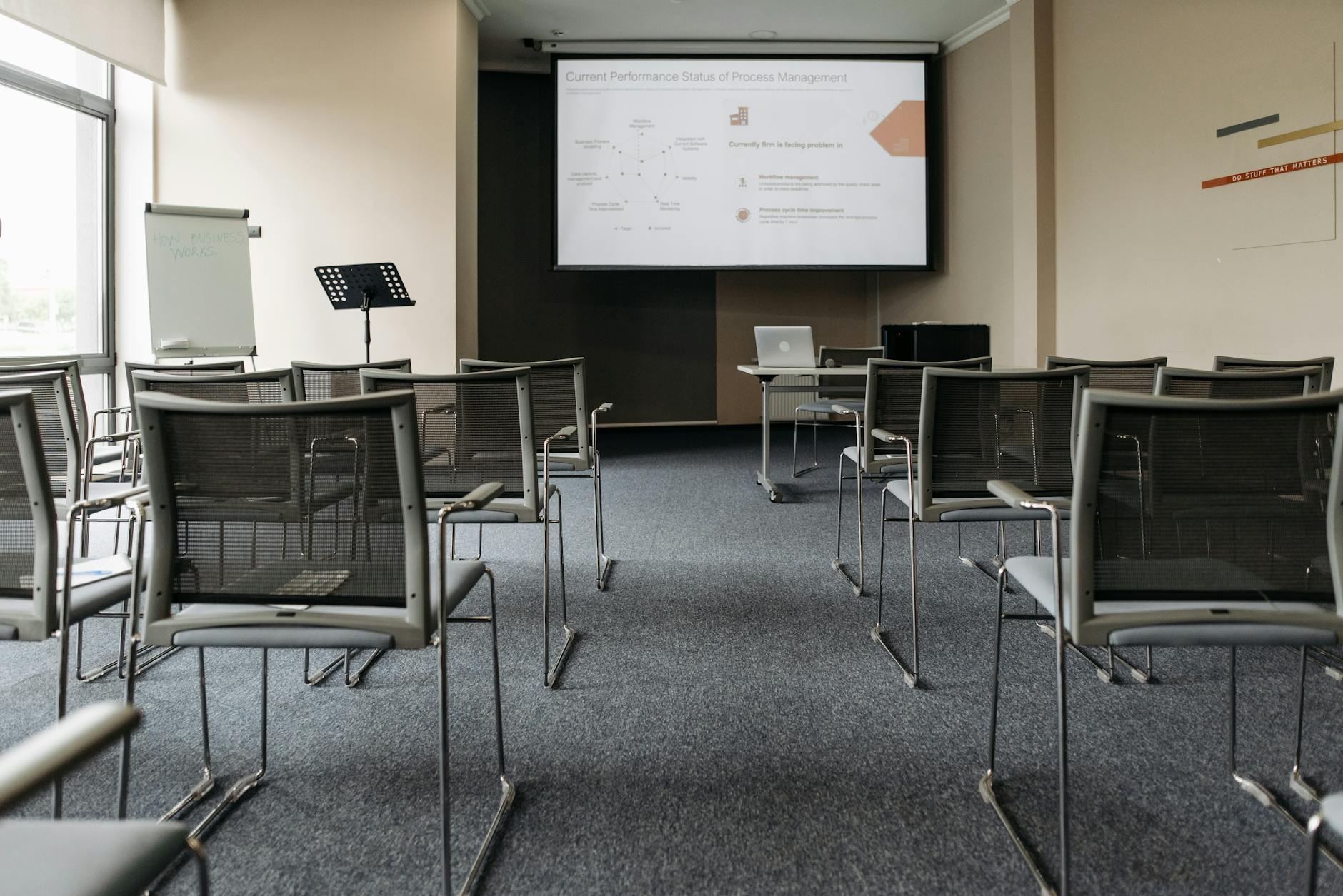
From your laptop in a meeting room. Plug into the HDMI or USB-C cable. Set the external display to Extend (Windows: Win+P > Extend; Mac: System Settings > Displays > arrange the second display next to the first). Switch on Presenter View as above. Test it five minutes before the audience walks in. Projector resolutions are still inconsistent in 2026, and a deck that looks fine on a laptop can crop at the edges on an old boardroom screen. I have seen it happen to a director presenting to the board. Of course the board was not amused.
From Microsoft Teams. The cleanest path is Share Content > PowerPoint Live. Open your deck in PowerPoint or upload it directly to Teams, then click PowerPoint Live in the Share tray. The audience sees the slides inside Teams. You get a presenter view that includes notes, slide thumbnails, and a translation option for multilingual audiences (useful when your Singapore HQ is presenting to a Vietnam or Indonesia office). PowerPoint Live preserves animations, transitions, and live links. The alternative — Share Screen > PowerPoint window — is more brittle. PowerPoint Live is the better default.
From Zoom. Zoom does not have an equivalent of PowerPoint Live. You Share Screen and pick either the PowerPoint window or the slide show window. Tip: start the slide show first (F5), then in Zoom share the slide show window specifically, not your whole screen. Your audience sees the slides. You see Presenter View on your other monitor. The reverse is a classic blunder: sharing the editing view by accident, and the audience watches you click the Animations tab.

From a meeting room PC that is not yours. Bring the deck on a USB drive or download it from OneDrive on the room PC. Two things break decks on other machines. Missing fonts: the room PC does not have the corporate font you used. Missing video or audio files: they were linked, not embedded. Fix both before you leave the office. File > Options > Save > tick Embed fonts in the file (Windows) or Embed fonts under PowerPoint Preferences > Save (Mac). For any video or audio, insert with Insert > Video > This Device (which embeds it), not Insert > Video > Online Video. Do this once and you stop being the person who arrived at the venue to discover Calibri Light had silently been replaced by Times New Roman.
Hardware basics for any in-person delivery. A small wireless presenter (the Logitech R400 is the workhorse) lets you walk away from the laptop. A “B” key blanks the slide to black. “W” blanks it to white. A slide number followed by Enter jumps straight to that slide. These three shortcuts have saved more presentations than every fancy theme ever shipped.
PowerPoint for unusual use-cases: posters, infographics, interactive lessons
PowerPoint is not just for deck-shaped slides. Three use-cases are worth knowing, and most people miss them entirely.
A1 or A2 posters. Design > Slide Size > Custom Slide Size > set width 594mm and height 841mm for an A1 portrait poster (or 420mm by 594mm for A2). One PowerPoint slide becomes the whole poster. Use a grid (View > Gridlines) to lay out title, body, and image blocks. Export as PDF (File > Export > Create PDF/XPS) at the highest quality setting before sending to a print shop. Junior researchers at NUS, NTU, and SMU build their conference posters this way every year. It works, and you do not need to learn InDesign.
One-page infographics. Insert > SmartArt opens a gallery of pre-built diagram styles: List, Process, Cycle, Hierarchy, Relationship, Matrix, Pyramid. Pick one that fits your message, type your bullet items, and PowerPoint renders the diagram. Then go back to Design > Slide Size > Custom and resize the slide to A4 portrait for a print-ready infographic. Quick. Polished. No InDesign licence needed.
Interactive lessons or click-through quizzes. Insert > Link (or Ctrl+K) on a text or shape lets you link to a specific slide in the same deck. Combined with Slide Show > Set Up Slide Show > Browsed at a kiosk, you can build a click-through learning module that does not advance unless the user clicks. Some Singapore trainers use this for self-paced refresher courses without buying a separate learning management system. Cheap and effective.
These three uses explain why a lot of working professionals keep PowerPoint on their machine even when their main presentation tool is Canva or Google Slides. It is a quick layout tool for anything roughly slide-shaped that needs to print or run interactively.
Using PowerPoint effectively: 5 habits of people whose decks actually get read
Knowing every PowerPoint button is the easy part. Restraint is the hard part. Building a deck people actually read instead of clicking through and forgetting. After watching about 200 adult learners a year build their first decks in our Singapore training room, across 24 years and over 48,000 working professionals trained through Intellisoft Training, five habits separate the decks that work from the decks that do not.
1. One idea per slide. If your slide title cannot fit a single declarative sentence (something like “Q3 revenue grew 12% in Singapore, driven by enterprise renewals”), split it. Two ideas on one slide mean the audience has to choose which to listen to while you talk. They will pick the wrong one. Every time.
2. Read the slide from across the room before you ship. Stand back 3 metres from your laptop. Look. If you cannot read the smallest text, neither can the back row of your audience. The 30pt minimum for body text exists for exactly this reason. The same test from your phone, held at arm’s length, predicts how the deck will look in a small Teams window.
3. Use the 6-by-6 rule as a soft ceiling, not a religion. No more than 6 bullet lines per slide, no more than 6 words per bullet. The classic guideline. It is right about 80% of the time. A data slide with a table, or a quote slide with a longer sentence, are legitimate exceptions. Anything heavier than that, split the slide. Harvard Business Review’s research on presentations backs the same restraint principle from a different angle.
4. Put the conclusion on slide 1 and again on the last slide. Most decks bury the answer near the end. Move it to the top. The opening slide should say “we recommend X because of Y and Z.” Then the body slides explain Y and Z. The closing slide repeats the recommendation. The audience that loses attention in the middle (and someone always does) still walks out knowing the point.
5. Rehearse with Presenter View, not in your head. Click through the deck with Alt+F5 on. Time yourself. Watch your own speaker notes appear. Two practice runs catch the wobbles every time. Mental rehearsal almost always undercounts the time you actually take, because you skip the bits you have not yet figured out how to say.
Five habits, all simple, none flashy. They are also the difference between the decks that get the budget approved and the ones that get a polite “thanks, we will get back to you.” Singapore professionals are often over-trained on theory and under-trained on application. Most have heard of the 6-by-6 rule. Few have actually applied it under pressure. If delivery is the part you find hardest, our Business Presentation Skills training covers stagecraft, voice, and Q&A separately from the PowerPoint mechanics.
Where to go next
You now have a working map of PowerPoint: the interface, the seven-step deck build, the design hierarchy, animations with restraint, speaker notes and Presenter View, delivery from a laptop or in a Teams or Zoom meeting, the unusual use-cases, and the five habits that move the needle. Pick one deck you are about to build this week. Follow the seven steps. The second deck after that will be twice as fast. The fifth will be twice as fast again.
For deeper dives into specific features, see our companion guides:
- How to make a presentation in PowerPoint: the long-form version of section 3.
- How to use Presenter View in PowerPoint: section 6 in detail.
- How to design a presentation in Canva: for marketing-style decks where Canva is the better tool.
If you would rather learn in a room with a trainer, our WSQ Basic PowerPoint Course is two days, SkillsFuture-fundable, and works through real decks instead of toy examples. I hope you found this guide useful. Do try the seven-step walkthrough on your next deck and let the muscle memory do the rest.
[CourseCTA: primary]