Conditional formatting in Power BI is a powerful feature that enhances data visualization by allowing users to apply specific formatting rules based on the values of data points in charts.
This guide will cover the various aspects of conditional formatting, how to apply it effectively, and best practices for its use in Power BI reports and dashboards. By understanding and utilizing these features, you can create insightful and visually appealing reports and dashboards in Power BI that quickly convey key insights to the stakeholders.
What is Conditional Formatting in Power BI?
Conditional formatting in Power BI is a method of altering the appearance of data points in your reports based on certain conditions.
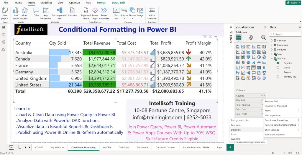
This extremely useful Power BI feature allows you to apply color formatting, icons, or data bars to highlight trends, outliers, or important values within tables and matrices.
By using conditional formatting, Power BI users can transform raw data into visually engaging analytics that emphasize key insights. It not only aids in identifying patterns but also enhances the usability of reports by making critical information stand out.
This feature is so important that we teach conditional formatting in our Power BI Beginners Course in Singapore, as well as the Microsoft Power BI Course with SkillsFuture Intensive course.
In Power BI, conditional formatting can be applied to any visual that supports it, such as tables and matrices. Users can select the field they want to format and define specific rules that dictate when the formatting should be triggered. This flexibility allows for a wide range of formatting options, from simple color changes to more complex icon-based indicators, making it a versatile tool for any data analyst or report creator.
Benefits of Using Conditional Formatting
The benefits of using conditional formatting in Power BI are numerous and significant. Firstly, it enhances the readability of reports by allowing users to quickly identify trends and variations in the data.
Using color formatting to distinguish between high and low values can provide immediate insights into performance metrics. Secondly, it helps in data storytelling, enabling users to convey complex information succinctly and effectively.
Moreover, conditional formatting can improve the decision-making process by highlighting critical areas that require attention. By drawing focus to certain data points, stakeholders can prioritize their actions based on visual cues. This capability not only makes the reports more interactive but also facilitates a deeper understanding of the data being presented, thus making conditional formatting an essential feature for any Power BI user aiming to create impactful reports.
Types of Conditional Formatting Options Available
There are multiple types of conditional formatting options in Power BI:
- Color Scales in Foreground color or the Background color
- Data Bars
- Icon Sets
Power BI offers a variety of conditional formatting options that cater to different user needs. Among the most common types of formatting are color scales, which allow users to apply gradient colors to data points based on their values. This can be particularly useful in visualizing performance metrics over time. Additionally, users can apply data bars, which provide a quick visual representation of values relative to one another within a table or matrix.
Another powerful option is the use of icons, which can indicate trends or statuses, such as up or down arrows to signify growth or decline. Furthermore, users can leverage field value-based conditional formatting, which allows formatting rules based on specific field values.
This versatility in formatting options ensures that users can find the most effective way to communicate their data, making Power BI a robust tool for data visualization and analysis.
Microsoft adds tons of flexibility in using Conditional Formatting to enhance our user experience.
How to Apply Conditional Formatting in Power BI?
Step-by-Step Guide to Apply Conditional Formatting
Where is conditional formatting in Power BI? It lives in the Format pane (the Paintbrush icon) of any visual that supports it — most commonly tables and matrices. To apply conditional formatting in Power BI, start by selecting the visual you wish to format. Then, navigate to the ‘Format’ pane (denoted by the Paintbrush symbol) and locate the conditional formatting section for that visual. From here, you can choose the specific field that you want to apply conditional formatting to.
The next step involves selecting the type of formatting you wish to use, such as color formatting or data bars. Once you’ve configured the desired settings, click ‘OK‘ to apply the changes, and your visual will reflect the new formatting based on the specified criteria.
Additionally, Power BI provides users the ability to edit or remove conditional formatting at any time. If you need to adjust your formatting rules, you can return to the same section in the ‘Format’ pane and modify the settings as needed.
This flexibility makes it easy to refine your visuals and ensure they accurately represent the underlying data. By following these simple steps, you can effectively enhance your Power BI reports with conditional formatting, making your data more engaging and informative.
You can join the practical, hands-on Power BI courses in Singapore at Intellisoft. They are SkillsFuture eligible and attract up to 70% WSQ Funding from SSG for locals.
Applying Conditional Formatting to Tables and Matrix Visualizations
Applying conditional formatting to a Tables or Matrix visualization in Power BI is a straightforward process that greatly improves data visualization.
- Begin by selecting the desired table or matrix visual from your report.
- Once selected, navigate to the ‘Format’ pane, where you will find options specifically designed for conditional formatting.
- You can choose which fields within your table or matrix to format and define the rules that will govern the appearance of those fields based on their values.
For example, you might want to highlight sales figures that exceed a certain threshold with a distinct color. By setting these rules, you can make data points visually distinguishable, allowing viewers to grasp key information at a glance.
Also, using data bars in tables can provide an immediate visual comparison of values, enhancing the overall clarity of the report. The ability to effectively apply conditional formatting to tables and matrices empowers users to create more meaningful and effective data presentations in Power BI.
Using Data Bars for Enhanced Visualization
Data bars are a dynamic feature within Power BI that enhances visualization by providing a graphical representation of data values within tables and matrices. By using data bars, users can quickly assess the relative size of each data point in comparison to others, making it easier to identify trends and patterns.
To implement data bars, navigate to the conditional formatting options within the ‘Format’ pane, select the field you wish to enhance, and choose the data bars option.
This feature allows for both horizontal and vertical data bars, which can be customized in terms of color and size. By leveraging data bars, users can transform a simple table into a visually compelling report that communicates data insights more effectively.
The integration of data bars not only improves the aesthetic appeal of Power BI reports but also facilitates a deeper understanding of the data, ultimately leading to more informed decision-making.
Just ensure that you have created a good Power BI Data Model by having proper Fact and Dimension Tables. Read Vinai’s blog articles on Data Modeling considerations in using Power BI.
What Are the Rules for Conditional Formatting in Power BI?
Creating Conditional Formatting Rules
Creating conditional formatting rules in Power BI requires an understanding of how to leverage the built-in options effectively. Users begin by selecting the field they want to format and navigating to the conditional formatting section within the ‘Format‘ pane.
From there, they can choose to add rules based on specific criteria, such as numeric thresholds or categorical values. If you want to highlight sales figures that exceed a specific target, you can set a rule that applies a color format to those values.
It’s essential to ensure that the rules are clear and concise, as this will enhance the readability of the report. You can also combine multiple rules for more complex formatting scenarios.
By meticulously crafting these formatting rules, Power BI users can create reports that not only look better but also communicate critical insights more effectively, making the data more actionable for stakeholders.
Common Formatting Rules to Consider
When creating formatting rules in Power BI, it’s important to consider some common strategies that can enhance the effectiveness of your reports.
- One prevalent approach is to use color scales, which visually represent data ranges and help users understand the distribution of values at a glance. For example, a gradient color scale can indicate low, medium, and high values, providing immediate visual cues about performance metrics.
- Another common rule is to apply formatting based on specific thresholds. For instance, you might want to highlight any data points that fall below a certain value, drawing attention to areas that may require further investigation.
- Additionally, using icon sets can offer a quick visual representation of status changes, such as arrows or flags indicating performance trends. By incorporating these common formatting rules, Power BI users can create insightful and actionable reports that effectively communicate critical data narratives.
Field Value-Based Conditional Formatting
Field value-based conditional formatting in Power BI allows users to apply formatting rules that respond to the actual values within a specified field. This type of conditional formatting can be particularly useful when dealing with categorical data, where users may want to highlight specific categories based on their importance.
You could set rules to apply different colors to various product categories based on their sales performance, enhancing visual differentiation.
To implement field value-based conditional formatting, navigate to the conditional formatting options in the ‘Format’ pane and select the field you wish to format.
After selecting the field, you can define specific formatting rules that target particular values or ranges. This capability provides users with a powerful tool for creating dynamic reports that respond to the underlying data, making it easier to identify trends and insights that are critical for effective decision-making.
How to Customize Conditional Formatting in Power BI?
Using Power BI Custom Visuals for Conditional Formatting
Power BI custom visuals offer an exciting avenue for enhancing conditional formatting beyond the default options. By integrating custom visuals into your reports, you can tailor the appearance and interactivity of conditional formatting to better suit your data’s storytelling needs.
Many custom visuals are available in the Power BI marketplace and can be easily imported into your reports, allowing you to apply unique formatting options that are not available in standard visuals.
For instance, certain custom visuals may offer advanced chart types or interactive elements that can provide a more dynamic representation of your data. By leveraging these custom visuals, users can create more engaging reports that draw viewers’ attention to key insights.
Moreover, custom visuals can be designed to incorporate specialized conditional formatting rules, allowing for a higher degree of customization and flexibility in how data is presented within Power BI.
Advanced Customization Techniques
Advanced customization techniques for conditional formatting in Power BI enable users to create highly tailored and impactful reports.
One such technique is the use of DAX (Data Analysis Expressions) to define complex conditional formatting rules based on calculations and logical conditions. By implementing DAX formulas, users can create dynamic formatting that changes based on user interactions or data changes, enhancing the overall responsiveness of the report.
Additionally, users can consider combining multiple layers of conditional formatting to create a more visually rich experience. For example, you can apply both color scales and data bars to the same visual to provide a comprehensive overview of the data.
Experimenting with transparency settings and layering different formatting options can also lead to more sophisticated visualizations. Such advanced techniques not only elevate the quality of Power BI reports but also ensure that critical data insights are effectively communicated and easily understood by the audience.
Removing Conditional Formatting from Visuals
Removing conditional formatting from visuals in Power BI is a straightforward process that allows users to refine their reports as needed. If you find that certain formatting rules are no longer relevant or effective, you can easily revert to the default appearance of your visual.
To do this, navigate to the ‘Format’ pane and locate the conditional formatting section for the specific visual. Here, you can select “remove conditional formatting” for any field previously formatted.
You also have an option to remove all conditional formatting from a visual. Choose this if you want to get rid of this completely.
This feature provides users with the flexibility to streamline their reports and ensure that the visuals remain clear and focused on the most pertinent data.
Additionally, removing unnecessary formatting can help improve performance and loading times for reports, especially when dealing with large datasets. By managing conditional formatting effectively, users can maintain the integrity and effectiveness of their Power BI visuals, ensuring they consistently convey the intended insights.
Best Practices for Conditional Formatting in Power BI Reports
When to Use Conditional Formatting
Knowing when to use conditional formatting in Power BI is crucial for maximizing its effectiveness. Conditional formatting should be employed primarily when it adds value to the data presentation, such as highlighting trends, anomalies, or critical performance indicators. For instance, if you’re analyzing sales data, using conditional formatting to emphasize figures that exceed targets can provide immediate visual feedback to stakeholders.
Additionally, consider using conditional formatting when dealing with large datasets where patterns may be difficult to discern at a glance. By applying color scales or data bars, you can draw attention to important variations in the data.
However, it’s essential to strike a balance—overusing conditional formatting can lead to cluttered visuals that may confuse rather than clarify.
Therefore, applying conditional formatting judiciously ensures that your reports are both informative and visually appealing, enhancing overall readability.
Avoiding Common Mistakes in Power BI Conditional Formatting
Avoiding common mistakes in Power BI conditional formatting is essential for creating effective reports.
One of the most frequent pitfalls is overcomplicating formatting rules, which can lead to confusion and misinterpretation of the data.
It’s crucial to keep formatting simple and intuitive, focusing on key insights rather than trying to convey too much information at once.
Moreover, ensure that color choices are accessible and consistent, as poor color combinations can hinder readability.
Another common mistake is neglecting to test formatting rules with actual data. It’s important to visualize how conditional formatting will appear under different scenarios to ensure it functions as intended.
Be mindful of the audience needs and requirements related to identifying trends. Tailoring the formatting to the preferences and needs of the report viewers can enhance engagement.
By avoiding these mistakes, users can create Power BI reports that are not only visually appealing but also effective in communicating the necessary insights clearly.
Tips for Effective Data Visualization
Effective data visualization in Power BI hinges on a few key principles that enhance the overall quality of reports. Firstly, always prioritize clarity and simplicity in your visuals. Use conditional formatting to highlight essential data points, but avoid cluttering your reports with excessive colors or icons that may distract from the message.
A well-defined color palette can help maintain consistency and improve the visual experience.
Secondly, leverage the power of interactivity in your Power BI reports. Incorporating features such as tooltips or drill-throughs allows users to explore the data further and gain additional insights.
Lastly, always consider the context of the data; provide meaningful labels and titles that guide the viewer’s understanding of what they are seeing.
By adhering to these tips, Power BI users can create compelling and effective data visualizations that resonate with their audience.
Common Issues and Troubleshooting with Conditional Formatting in Power BI
Why Isn’t My Conditional Formatting Working?
When conditional formatting in Power BI fails to work as expected, it can be attributed to several common issues. One potential reason is that the selected field for formatting may not contain the required data types, as conditional formatting rules are often contingent on numeric or categorical values.
Additionally, formatting rules may conflict with each other if multiple conditions are applied to the same field, leading to ambiguity in how data points are displayed.
Another possibility is that the visual being used may not support certain conditional formatting options. Users should always ensure that the chosen visual type allows for the desired formatting before applying any rules. Checking the formatting pane for any overrides or conflicts is also a prudent troubleshooting step.
By diagnosing these issues, users can better understand why their conditional formatting isn’t functioning and take the necessary steps to rectify the situation.
Fixing Common Problems with Conditional Formatting
Fixing common problems with conditional formatting in Power BI requires a systematic approach to identify and resolve issues. Start by reviewing the formatting rules applied to ensure they are set correctly and that the conditions accurately reflect the intended logic. It’s also beneficial to examine the data itself; confirm that the field values are appropriate for the conditional formatting being used. If the rules are based on specific thresholds, verify that those thresholds align with the actual data range.
Moreover, if multiple formatting rules are in place, consider simplifying them to avoid conflicts. Sometimes, consolidating rules can lead to clearer visuals. If a particular visual does not respond to the formatting as expected, try switching to a different visual type that supports the desired conditional formatting options. By addressing these common problems systematically, users can restore effective conditional formatting in their Power BI reports and ensure that visuals accurately reflect the underlying data.
Tips for Troubleshooting Formatting Rules
Troubleshooting formatting rules in Power BI can be streamlined by following specific tips that enhance clarity and effectiveness. Firstly, always test your formatting rules with sample data to observe how they behave in real scenarios. This practice allows users to identify potential issues early in the process.
Secondly, consider using the “Preview” option available in Power BI, which enables you to see how your conditional formatting looks before finalizing it in the report.
Additionally, regularly revisiting existing formatting rules after changes in data or report structure can help prevent outdated rules from hindering the effectiveness of your visuals.
Maintaining a consistent naming convention for fields and rules can also simplify the troubleshooting process, making it easier to locate and edit specific formatting conditions.
By implementing these tips, Power BI users can efficiently troubleshoot and refine their conditional formatting, ensuring that their reports remain clear and insightful.
Frequently Asked Questions about Conditional Formatting in Power BI
Q: What is Power BI conditional formatting based on?
A: Power BI conditional formatting based allows users to change the appearance of visuals in Power BI based on the data values. This feature enhances data visualization by applying different formats to cells, such as background color formatting, based on specified rules.
Q: How do I add conditional formatting to a visual in Power BI?
A: To add conditional formatting in Power BI, first select the visual to which you want to apply formatting. Then, from the visualizations pane, navigate to the “Format” section and select “Conditional formatting.” From there, you can choose the type of formatting you want to apply, such as background color based or bars based.
Q: What are the steps to apply Power BI conditional formatting based on a field value?
A: To apply Power BI conditional formatting based on a field value, you need to select the visual, go to the “Format” pane, and choose “Conditional formatting.” Next, select “Field value” as your format style and specify the target field. Finally, define the rules for how the formatting should be applied based on the values in that field.
Q: Can I use basic conditional formatting in Power BI from scratch?
A: Yes, you can use basic conditional formatting in Power BI from scratch. Start by creating your visual, then access the “Format” pane. From there, you can select conditional formatting options and set up rules to format your visual according to your data’s characteristics.
Q: What types of conditional formatting does Power BI support?
A: Power BI supports various types of conditional formatting, including background color formatting, font color changes, and data bars. You can apply these formats based on numerical values, categorical conditions, and field values to enhance visual interpretation of your data.
Q: How do I remove conditional formatting from a visual in Power BI?
A: To remove conditional formatting from a visual in Power BI, you need to select the visual, go to the “Format” pane, and locate the “Conditional formatting” section. From there, you can select “remove conditional formatting” for the specific formatting option you wish to eliminate.
Q: Is it possible to apply conditional formatting for a field in a table visual?
A: Yes, it is possible to apply conditional formatting for a field in a table visual. Select the table visual, access the “Format” pane, and choose the field for which you want to apply formatting. You can then set rules for how that field’s values should be visually represented.
Q: What are the benefits of using Power BI conditional formatting?
A: The benefits of using Power BI conditional formatting include improved data visualization, enhanced readability of reports, and the ability to highlight trends and anomalies in data. By applying conditional formatting based on specific criteria, users can make data-driven insights more accessible and understandable.
Q: Can I use multiple conditions in Power BI conditional formatting?
A: Yes, you can use multiple conditions in Power BI conditional formatting. When setting up your rules, you can define multiple criteria that will trigger different formatting options. This flexibility allows for more complex and informative visuals that better reflect the underlying data.
AUTHOR of this article: Written by Vinai Prakash, the most popular Power BI Trainer in Singapore at Intellisoft. Vinai has trained thousands of Data Analysts and Decision makers in the use of Power BI, DAX Measures, using Time Intelligence, slicers, and effective dashboards.
By joining Vinai’s Power BI class, you can become the Data Storyteller Every Business Needs.
Imagine turning boring spreadsheets into stunning, interactive dashboards — and influencing real business decisions.
Over 2 days, you’ll transform from “just another Excel user” into a trusted data storyteller who can uncover patterns, predict trends, and captivate any audience with insights.
You won’t just learn Power BI. You’ll become a decision-driving force in your organization.
Vinai just don’t just teach Excel, Power BI, or AI tools alone… He builds learning ecosystems. From crafting detailed outlines and persuasive email funnels to building CRM systems in PHP, his mind constantly connects the dots across teaching, technology, business, and marketing. He is not just delivering content — but he is architecting experiences that scale.