5 Tips For a Great PowerPoint Presentation – Make an Impact!
“Death by PowerPoint” is the common dread of most people attending presentations, seminars and meetings. When you look at a thick slide deck showing “2 of 84“, you begin to get a sinking feeling in your heart… this is going to be another late night… another long long, never-ending meeting.
Save yourself and rescue your audience from this “sure disaster” presentation, and deliver an outstanding presentation using only Microsoft PowerPoint, but one, that gives you a standing ovation!
5 Tips to Great PowerPoint Presentations:
Yes, it is possible to get standing ovation from your well crafted Presentations. Simply follow these simple 5 Tips to Create & Present Great PowerPoint Presentations.
5 Tips to Great PowerPoint Presentations:
These 5 Tips for Great PowerPoint Presentations allows you create to do Charts, Using of Bullets, Graphics, Transmissions and effects.
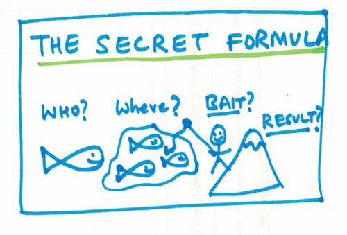
1. Keep It Simple & Create Intrigue
An effective presentation doesn’t have to be busy, full of content or voluminous. Apply the KISS principle – Keep it simple, stupid!
Steve Jobs, one of the greatest presenters, whose keynotes are the most watched presentations on YouTube was known to keep extremely light and simple presentations. The effect was that it was easily understood, and well received the world over.
If you are in doubt, go to YouTube here and watch some of his best presentations.
When you fill the slide entirely by words, everyone would be busy reading, and no one would be really listening to you. And once they have read everything, they get bored, and get impatient… waiting for you to move to the next slide. While being bored, they begin to play with their phones, and pretty soon you’ve lost them.
A simple presentation doesn’t use many words. A short word or sentence is displayed, sometimes along with a strong graphic. And the presenter talks through the idea. Because there is less to read from the slide, it creates intrigue.
Now the audience want to know more about it, and listen to you more attentively.
| Training Schedule | |
|---|---|
| 30, 31 Jul 2026 | |
| 27, 28 Aug 2026 | |
| 21, 22 Sep 2026 | |
| 22, 23 Oct 2026 | |
| 26, 27 Nov 2026 | |
2. Use Appropriate Charts
While you can present your data in a nice looking table, it is generally more difficult to spot any trend or focus area in a table. It is left to the audience to figure out the chart.
A picture is worth a thousand words. That’s why charts are so popular.
You can take the same table data, and present in a beautiful chart. It hardly takes a second to glance a chart and ‘get it’ most of the time. A visual looks pleasing to the eye and much less cluttered than a table.
However, because the charts are so easy to create, most presenters get it wrong. There is a big difference between any chart, done anyhow, or left to the default settings of Excel or PowerPoint, and a well chosen chart which displays and highlights the most important points easily.
Using Pie Charts
A Pie Chart makes sense if there are a maximum of 3-4 categories or slices to display. Any more, and the slices become so small, that it becomes difficult to perceive their subtle differences. Worse is a pie chart which is showing 10 or more categories – full of thin slices, and the legend is full of all the colors in the rainbow, and then some. Over 90% people find charts which show 8 or more categories can’t figure out the biggest one.
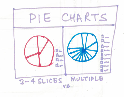
Best Practice of Using a Pie Chart:
- Create a Pie chart only for 5 or less than 5 slices. You can rotate the sections until the first one is aligned to the 12′ clock position. This makes it easier to perceive it.
- Make sure you create short labels.
- Finally, don’t use Monochrome colors to display a pie chart. The colored slices become very hard to comprehend, and if printed on a Black & White printer, all you get is 50 shades of grey.
Using Bar Charts
The default chart in Microsoft PowerPoint is a Bar Charts, and that’s why most people embedding a chart in PowerPoint use a Bar Chart. I have done hundreds of corporate, business presentations, and I never even experimented or play around with the different charts. I squarely used Bar Charts, and no wonder I hardly got any questions.
While bar charts are good, they are passé. Show some creativity, and create better looking bar charts. If you can show the same thing in a simpler pie chart, or a Combo chart, it may be even better!
Using Combo Charts
A Combo chart is a fantastic chart to display multiple things on a single chart. It is suitable for cases where the scale of two things that you are displaying are completely different, or really far apart.
If you think the Combo chart is a new type of chart, it is not. You can think it as a Line-Bar Chart.
In a Combo chart, we use both the Primary and Secondary axis on the Y Axis, to display different things.
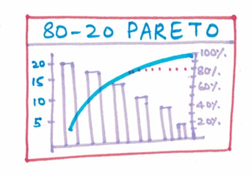
This is a useful chart, because it shows more and makes it easy to understand multiple things at the same time. A great tool to analyze data too!
I have created Pareto charts, also called the 80-20 Principle on Combo charts and have received accolades from the audience several times.
CXO level people simply love Combo charts the most!
3. Use Less Bullets & Lesser Words
The most common type of presentation are full of Bullets. In-fact, the default PowerPoint Templates only shows you how to create Bullets, Sub Bullets and sub-sub bullets. It easily goes up to 6 levels. And because it is so easy to indent and add more bullets, and more sub points, people fill their slides completely with bullets and text, leaving hardly any white space.
Having the points and sub points gives the presenter a lot of confidence – that they won’t forget their talking points. And when the presentation begins, the presenter simply begins to read the bullets points word for word.
Completely boring, and completely worthless. You’ve lost the audience completely.
Don’t get me wrong. I am not against Bullets. I am all for them. But I don’t like to write the entire text of your presentation next to the bullet.
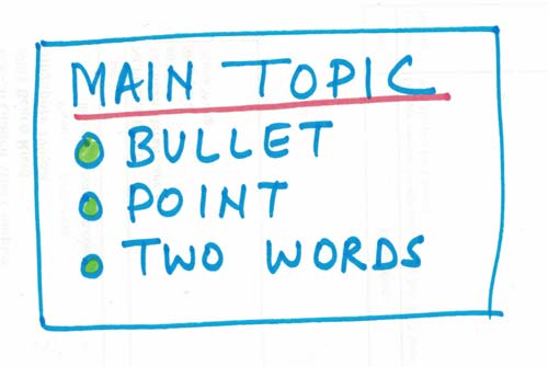
Keep the main points on the bullets. Short, 1-2 words that help you remember the points, but not sufficient to completely understand the slide without your presentation, explanation and moderation.
Effective presentation use a few bullets and even lesser words.
This gives you ample opportunity to explain more and take as much time as you need.
If you are running short of time, you can go through the points briefly, and if you see more interest in a slide, you can expand more and make the most of the opportunity and get as much attention as you deserve.
4. Use High Quality Graphics
Many a good presentations are marred by cheesy stock images and clip-art that have been overused over and over again. They put off people.
People judge your presentation and your content by the quality of your graphics and its visual appeal. If they have seen the images before, or the images are below quality, they tend to believe that your presentation is also run-of-the-mill, unremarkable – nothing exceptional or revolutionary!
High quality graphics may not be available in a single sweep of the first page of Google images. It requires a bit of thinking, a bit of planning, and a whole lot of searching to get the right, high quality graphic – something that will make people get it, immediately, without having to explain every bit.
Take your time to find the right image. It may be even better to create your own image or art.
Several images and charts used on this page and created by me, to illustrate the points better.
Don’t be afraid to break the norm, and try something new. It might bring more interest in your presentations.
Sometimes, my awesome graphics have won me a job, as it shows my creativity and the ability to think “out of the box”!
5. Limit Transitions & Effects
When Microsoft introduced Animation and Transition effects, they looked so cool! I went crazy trying out the awesome effects and it looked so magical to get words to rain down, fly-in, bump around and explode in myriad ways. In fact, my PowerPoint training at a school was a sell-out because the kids couldn’t get enough of the effects, and wanted to come for more classes to try out all the amazing effects.
However, when I tried the same thing at a business presentation, not many people were amused. I was quite taken aback.
During break, while chatting with an officer from the client team, I overheard the client mention that the presentation seemed so childish, and amateurish… :(
And I got similar feedback from many other quarters too. So I took action, and got rid of all the special effects and animations. It was back to boring. But it was more business like too! And then I added a bit of creativity, followed these 5 top tips for great presentations, and went to presenting jaw-dropping, awesome presentations, every time!
Business people like the more business type of presentation. So stick to business. But business like does not mean boring. You can make an effective presentation without using animation or cheesy effects.
These 5 Tips for Great PowerPoint Presentations let you do Mastering Presentation with your Creative & Visualized contents in front of your collegue.
Conclusion
It is entirely possible to present a fantastic, standing-ovation garnering presentation using only Microsoft PowerPoint.
5 Tips for Great PowerPoint Presentations
Follow these simple, basic 5 tips for Great PowerPoint Presentations, and you are on your way to creating and presenting awesome presentations.
Make an impact with 5 tips for Great PowerPoint Presentation. Change the world, one Presentation at a time!
About Vinai Prakash
Vinai is the founder and master trainer at Intellisoft Training. A corporate trainer with over 30 years of experience, Vinai is passionate about teaching simple concepts in an easy manner. He writes on several blogs, magazines, and speaks on Presentation Techniques, Public Speaking, Data Analytics, Project Management in several countries around the world, Visit Vinai’s personal website here for more information. Attend his upcoming data analytics training workshops. or the Killer Presentation Techniques by registering on our website.